 |
| Option One |
 |
| Option Two |
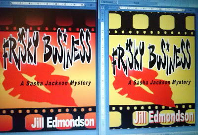
The above two pics are simply screenshots, done on my camera phone, so don't be concerned about the resolution. The real cover will be clearer!
The background for Option One is lighter, and I think that works better and is more visually appealing... I think.
The title for Option Two has more blood spatter, which I think makes it more interesting, but also maybe makes it more gory... and I would hate to turn off readers by having an overly icky, seemingly very violent cover.
Also: with Option One, three S's are turned into dollar signs (don't know why I didn't do all four!), and I think that works better than just doing so with one, like in Option Two.
 |
| Option Three |
Another possible style is shown above. I like the font for the title (or is it too silly???), and I like the lips and the film tape, again, of course. Not sure about the background colours though. The image on the left is too "sunsetish" - makes me think it's set in Arizona. On the other hand, the picture on the right is a bit bland. However, with the image on the left side, the title overlaps the filmstrip, and I like that. Having it entirely below (as it the right side image) feels a bit choppy somehow... In this style, the $ for the S didn't look right, so it's just letters this time...) Overall, these two just seem too busy, too glaring... As above, these are dummy shots, photos taken of the images on my computer screen, so please forgive the quality!
 |
| Option Five |
 |
| Option Six |
 |
| Option Seven |
Then, there are the images above. Options 5 and 6 are in the same style and are basically the same colour scheme as the covers for Dead Light District and The Lies Have It. (Option #7 is basically the same as #5, but with a tad more yellow and some minor changes to colouring). I like the bright blues on #6 plus the fact the scheme is basically three colours, but I don't like the shape of the woman. And the film clicker in #5 is more prominent, which I think is a good thing. None of these last three samples use a $ in place of an "S". That would be easy enough to change, but I'm not sure it's necessary...
In any case, the cover will probably go through 582,031 revisions before the final image is selected, but perhaps for now this gives you an idea of what's in store...
I would absolutely love to hear your feedback!
I love the creativity here!!! Wow! Since you asked for feedback, I like Option 5 the best. I like the idea of a cover that's consistent with your others. And that one says a lot about the book in just a few carefully-planned lines, so to speak. But that's just one person's view...
ReplyDeleteThanks Margot!
ReplyDelete